by Rachel Amphlett
You know that saying, “if it ain’t broke, don’t fix it?” Well, by the end of 2014, it was pretty evident to me that something was seriously wrong with the covers for the first two books in my Dan Taylor thriller series. I needed to fix them. And Yes, Readers Do Judge Books by Their Covers!
 Don’t get me wrong – I liked my old covers. Reviews for the books were great, too. The problem was, not enough people were picking up the book, so sales were abysmal. You can only kid yourself for so long when you carry on like that.
Backstory: My third novel, a standalone thriller entitled Before Nightfall, was going great guns; I’d just had an extremely profitable promotion during September 2014, and I had sat down to write my marketing plan for 2015. I’d made a conscious decision to start treating my writing like a small business, and as anyone who runs a small business (meaning every self-published author) will know, that means being honest with yourself.
It turns out “kill your darlings” can apply to your book covers, not just your characters.
I knew in my heart I was going to change them, so given the sort of reader that is attracted to the series, and the type of characters I have, I spent a lunch break in a bookshop and really looked at what my peers’ covers looked like. What were the common themes? How did their cover designers put colour to use?
After that, I emailed a few author friends to seek their input. What did they think of the existing covers? What did they think of the ideas I had for changing them? What did they hate about book covers they’d seen? Between their feedback and my research, I narrowed my requirements down to a few points:
Covers must appeal to male & female readers

The Previous Design
At that time, the darker covers were definitely appealing to a male rather than a female audience; a shame, given that a lot of women enjoy the novels. However, feedback showed that women were definitely put off by the dark colours and couldn’t relate to what the novel might be about.
By contrast, it would have been a bad idea to replace the old covers with new ones depicting shirtless men. Nice eye candy for us ladies perhaps, but I’d risk alienating my male audience!
No one wanted to see the protagonist’s features
I don’t know about you, but I like using my imagination when it comes to characters. I wanted to maintain an air of mystery about Dan Taylor, so the shadowy man on the cover was a definite ‘must have’ for me. Again, you only have to look at the novels by authors like Robert Crais, Chris Ryan, Lee Child, and Vince Flynn, to see how popular this theme is.
Don’t be afraid to use colour
I have all the Lee Child and Vince Flynn books on my shelf at home, so the next thing I did was lay them out on the floor to get an idea of how much colour is used on these thrillers. Even if a grey tint is used (Vince Flynn’s Transfer of Power, or Lee Child’s Personal, for example), then the title or author name is very bright to contrast. And no one was using a black background.
I’d used a different cover artist for Before Nightfall earlier that year, because the book was a standalone and I wanted it to look dramatically different from the Dan Taylor series. You only have to look at the use of colours on that artwork to see why it attracted so many new readers, and I still get a lot of compliments about that cover. It works well as a paperback cover on a shelf, and doubles up well as a thumbnail image for eBook retailers.
Get ideas from stock photo sites
I approached the same cover artist with my proposal for updating the covers for White Gold and Under Fire. Because I obviously knew what the stories were about, and had carried out all the research, I also sent him links to stock photos that interested me; we didn’t buy them until we’d settled on the design, thereby saving money while we knocked ideas around.
(Note from Molly: Depositphotos and Dreamstime are two of my favorite inexpensive stock photo sites)
Once the covers were ready, I re-launched the books at the end of 2014 and did some paid promotions through January and February.

White Gold’s NEW Cover
The response was amazing. White Gold flew off the virtual shelves, and to this day remains in the top ten in free military thrillers. Under Fire holds its own in the paid charts, as well. And I’m finally getting a regular income from the books.
In hindsight, it wasn’t money or knowledge that was preventing me from changing the covers. The only thing that was really holding me back was fear.
For some reason, I spent 12 months convincing myself that the covers were okay as they were. I’d hate to think how many potential readers I missed simply because I hadn’t done my homework properly and was too scared to do anything about it.
Was it expensive?
Not when compared with how much I’ve gained by updating the cover designs. I’m sitting here writing this weighing up what I’ve made in book sales this year compared to the cost of the covers, and I still think it was worth it. You need to expect to pay about $400-$600 for a cover design, but this depends on whether you’re having a paperback cover as well as an eBook cover design.
I’m gaining visibility through those covers all the time, and I’m continuing the theme with the third book in the series (Three Lives Down) that will be published in November 2015. I’m using a different cover designer, but now that I understand more about the importance of design, I can confidently put forward ideas for the book, and the process is quicker and more rewarding.
These days, I look forward to writing my next book, because I know that I’ll have another great cover to add to the collection.
 Before emigrating to Australia in 2005, Rachel Amphlett helped run a pub, played lead guitar in bands, worked as a TV and film extra, dabbled in radio as a presenter and freelance producer for the BBC, and worked in publishing as a sub-editor and editorial assistant.
After returning to writing, Rachel enjoyed publication success both in Australia and the United Kingdom with her short stories. Her first thriller White Gold was released in 2011, with the Italian foreign rights for the novel being sold to Fanucci Editore’s TIMECrime imprint in 2014. Check out Rachel’s Amazon Author Page to see all her covers.
Note from Molly: Joanna Penn wrote a post suggesting cover design vendors. For Do-It-Yourselfers and the budget-conscious, Joanna also posted a great article about creating your own covers using MS Word, and The Book Designer offers a template for creating the print version. Good luck!
Authors, have you updated – or considered updating – your book covers? Readers, what is it about a cover that compels you to read the book? Please leave a comment and share!
All original content by Molly Greene and guests is copyright protected – did you enjoy the article? You can show your support by checking out Molly’s Amazon Author Page – and hey, buy a book while you’re there! Or, subscribe to this blog and you’ll never miss the weekly posts. Your email will NOT be sold, shared, abused, or rented – that’s a promise. If you’re not already, follow @mollygreene on Twitter. Mwah! Thank you so much.


I really like the new version of the cover for White Gold, and I can see why it appeals to both genders. I recently published an ebook, and in the cover design, I wanted to capture those who would enjoy the mystery, hence the magnifying glass; those who are captivated by numbers, hence the calculator and spreadsheet; and those who are word people, hence the use of numbers for some of the letters in the title. Cover design is critical to the success of the book, both in print and digital forms.
EXACTLY, Leeann, and thank you – it’s also so much fun to contemplate the possibilities 🙂
So true, Leeann! And I still review other books in my genre, to keep on top of new trends now.
Good one, Molly and Rachel. I love your new cover set, Rachel.
I dread the thought of changing my cover for Poison Bay, so I comprehend the courage that went into killing those particular darlings.
I’m open to the thought I might have to change my cover, but I’m leaving it as a problem for Future Belinda to tackle. 😉
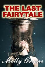
Ha – I’m with you, Belinda! I love Rachel’s covers, as well, and I’m sure someday I’ll make the decision to update my own – but I think I’ll put it on the docket to consider this time in 2016.
It really was the “fear factor” that held me back, Belinda. I should’ve done something about it at least 12 months before I actually did!
Great blog and a wonderful idea to give sagging book sales a facelift with a change in your book cover. Even if your current book cover is rather nice but a bit behind in the current trends in book cover design, a change of cover could be needed to renew interest and have sales rolling again. Thanks for the advice…
You are so right, DK – trends change, especially in genre fiction, and we’d be smart to keep up.
Thanks, DK – happy to have helped.
You know, I never thought about colors in this way before, how some attract different readers. Personally, dark or black covers intrigue me, though my blood runs crime anyway. Excellent post. Thank you for sharing your story. Hey, Molly. *waves*
Hi Sue! *waves back* I like dark covers, too, overall – right now I’m fascinated by Sue Grafton’s “X” – ohhh, to be that well-known.
I know, Sue – when I organised those original colours all I could think about was the story, not first impressions. An important lesson that I’m more than happy to share.
I usually design my covers early in the writing process. Then later I trash them and come up with something much better before I actually publish. I use Derek Murphy’s cover templates as a model. Not very expensive and pretty easy to use. I substitute my own fonts to keep the brand consistent. That works for me.
I mock up a cover before I start to write, too, Connie – and in case someone’s interested, here’s the link to Derek Murphy’s cover design site.
Those covers of Derek’s are great, Connie!
Great post! I do like the new cover Rachel. What a difference.
Thanks Molly!
Our pleasure, Kim!
Thanks, Kim – appreciate the feedback. I’ve got to admit, it made it easier approaching the next book in the series, if that makes sense…
I have someone who will do cover artwork for nothing, though only for our critique group. But there is something about covers that gets right up my nose: why, when a book becomes a successful film, do publishers have a still from the film on the front? The point of a cover is symbolic and not meant to represent a scene.
Hollywood 🙂
Great ideas here! I can really see how the updated book cover appeals to a broader audience. Redoing my book covers is on my to-do list, but not until 2016 🙂 I’ve got to get through this year first!
Thanks Emily! And I’m with you about the to-do list.